A cohesive dessert table color scheme begins with choosing what will stay quiet. If the cloth, cake, cupcake wrappers, flowers and serving dishes all compete for attention, adding another matching decoration rarely solves the problem. Reduce the number of strong colors first, then repeat the remaining shades deliberately across the table.
The aim is not to make every dessert the same color. Chocolate, pastry, berries and cream already bring a useful range of tones. Your palette should connect those natural colors with the occasion, while leaving the food recognizable and appetizing. A restrained plan can work with assorted homemade desserts just as well as a coordinated bakery order.
Count the colors that are already present
Set out the serving dishes, table covering and any finished decorations before buying more supplies. Look at them together in the space where they will be used. A cream stand may appear warm beside pure white napkins; a gray wall may make pale lavender frosting seem cooler than it looked in the kitchen.
Next, list the colors of the actual desserts. A chocolate cake occupies a large dark area, even when its decoration is pale. Golden cookies add warmth; red berries can become a strong accent. Ignoring these colors while planning the frosting often produces a display that feels different from the original mood board.
If the menu is already fixed, choose the palette around it. A dessert board with chocolate brownies, golden biscuits and berries may need only neutral dishes and one repeated napkin color. If the dessert menu is flexible, you have more freedom to choose frosting shades, but the colors still need to suit the foods beneath them.
Give each color a different job
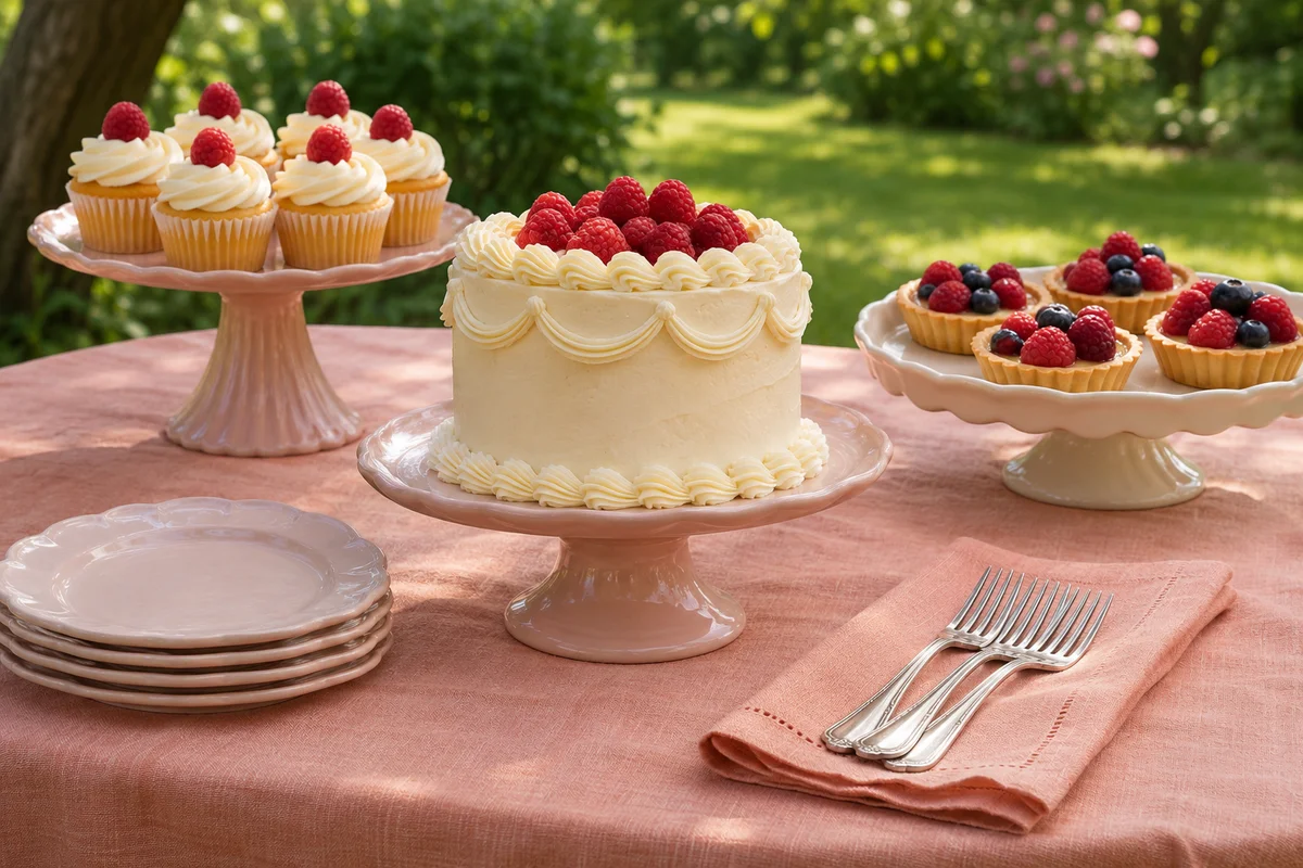
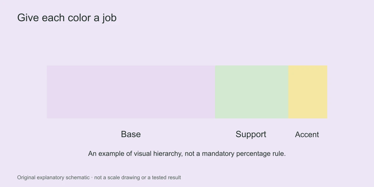
Use a main color for the broadest visual area, a supporting color to provide contrast and a small accent to draw attention. These are roles, not fixed percentages. The main color might be an ivory cloth and cream cake rather than a bright theme color spread across every item.
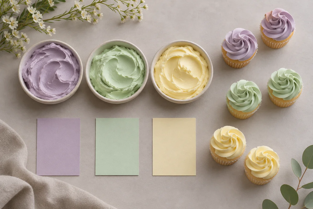
Suppose you choose lavender, mint and creamy yellow. Ivory serving dishes can keep the combination gentle, lavender can appear on the focal cake, mint can recur in a few cupcake details and the yellow can remain a small cheerful accent. Reversing those roles creates a different mood without requiring different colors.
Do not interpret a palette as an instruction to dye every dessert. A plain buttercream finish, natural fruit or a chocolate surface can provide the restful area that lets the accent color stand out. That restraint also reduces the number of separate frosting batches you need to prepare.
Use a palette table to make practical decisions
| Palette | Main visual area | Supporting details | Useful restraint |
|---|---|---|---|
| Lavender, mint and cream | Cream cloth and dishes | Lavender cake details and mint cupcake accents | Keep brighter green decorations scarce |
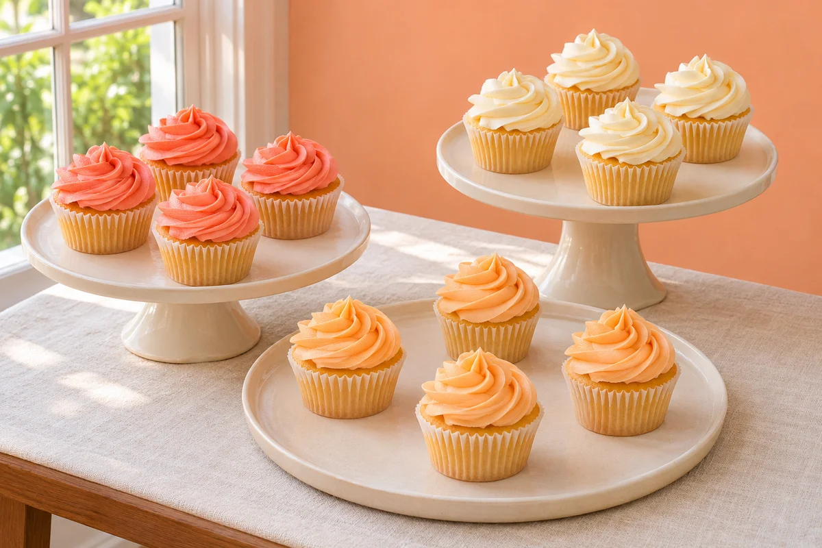
| Coral, apricot and ivory | Ivory backdrop | Apricot frosting with occasional coral piping | Choose one warm metal finish, if any |
| Cocoa, raspberry and warm white | Chocolate desserts and white serving pieces | Raspberry fruit or a small red textile accent | Avoid adding unrelated pastel wrappers |
| Soft blue, lemon and cream | Cream cake and neutral table covering | Blue piping with small lemon-yellow details | Keep blue pale enough to suit the intended mood |
| Caramel, burgundy and oatmeal | Natural pastry and oatmeal linen | Burgundy berries with caramel-toned biscuits | Let natural food colors replace extra props |
These combinations are styling examples rather than rules about which colors belong to a season. The same lavender palette can feel springlike with pale dishes or more formal with a dark background. Decide based on the room, the celebration and the desserts, not a seasonal label alone.
Test frosting shades beside each other
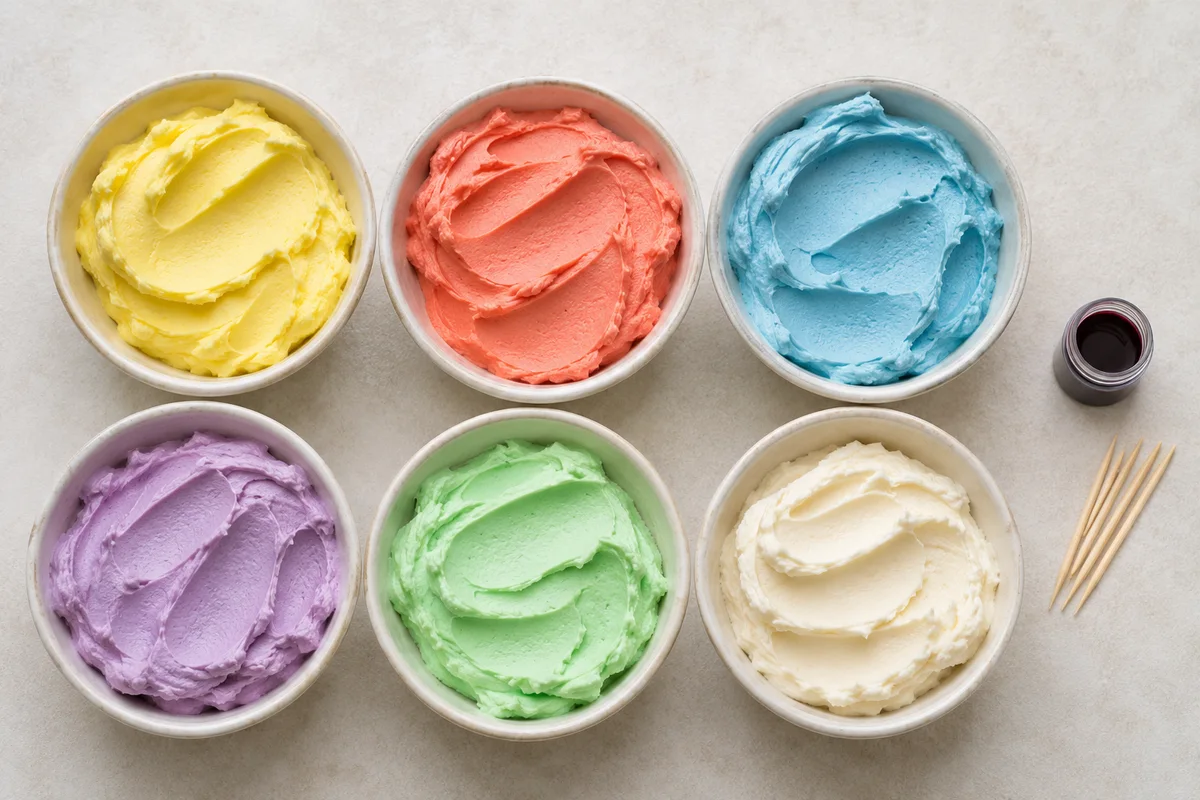
Mix a small sample of each planned frosting color and place the samples next to the actual wrappers or serving pieces. Judge the relationship between the shades, not just whether each shade looks attractive on its own. Two soft colors can lose their distinction when their lightness is almost identical.
Look at the samples in the intended light. Warm indoor bulbs can make ivory appear yellower and soften some cool colors; strong daylight may reveal differences that were hidden under a kitchen light. A phone photograph is useful for comparing the arrangement, but the screen is not a reliable color standard.
When preparing the full frosting batch, record how you reached the sample rather than adding color from memory. Our guide to coloring buttercream explains gradual additions and texture checks. If the color becomes streaky, follow the separate uneven buttercream color guide before mixing more shade variations.
Repeat colors across the table, not on every dessert
A color feels intentional when it appears in more than one separated location. You could echo a small cake detail with a group of cupcake wrappers or a napkin stack, rather than decorating every cookie in the same shade. Place those echoes where they guide the eye through the display.
Avoid isolating all the deepest color at one end unless that imbalance is deliberate. A dark chocolate cake on one side may need a small cluster of chocolate treats elsewhere to connect it with the rest of the table. Alternatively, move the cake nearer the visual center and let the lighter items surround it.
- Identify the broadest background color.
- Choose the focal dessert and its strongest visible shade.
- Repeat that shade in a smaller supporting area.
- Add the quieter supporting color where the display needs connection.
- Remove accents that compete with the focal point.
For cupcake groups, decide whether colors will be blocked together or alternated. A clear pattern can make a mixed collection look coordinated even when the piping shapes differ. See the cupcake arrangement guide for ways to combine color grouping with accessible spacing.
Use neutral space to prevent visual overload
Neutral does not have to mean pure white. A wood surface, oatmeal cloth, charcoal plate or cream stand can provide a quiet setting. Choose the neutral that suits the natural colors of the desserts and the atmosphere of the room. Adding every available neutral can become another form of clutter.
Leave some of that background visible. A continuous blanket of sweets, flowers and confetti removes the separation that makes color groups readable. The small dessert table guide treats open space as part of the serving plan as well as the composition.
If the display still looks busy, remove a patterned textile before changing the food. Strong patterns can introduce several extra colors and compete with detailed frosting. A simple runner may connect the palette more effectively than a tablecloth that tries to repeat every shade.
Adjust an existing collection instead of replacing it
Imagine that your serving dishes are blue, but the celebration colors are coral and peach. You do not need to hide every blue surface. Use a pale neutral cloth, let the blue act as a cooler background, and keep the warm frosting colors in deliberate groups. Avoid introducing several additional blue shades through unrelated props, which would make the serving pieces feel like the beginning of a second competing theme.
If a finished cake is much brighter than expected, simplify what surrounds it. Plain cupcake wrappers and quieter linens can make a vivid cake look intentional. Trying to match that brightness in every supporting dessert often expands the problem instead of connecting the display.
For a collection supplied by several home bakers, ask for one shared detail rather than identical results. A neutral wrapper, a restrained garnish style or a common serving plate can establish continuity while allowing each dessert to keep its own character. Do not promise an exact frosting match when recipes, ingredients and lighting differ.
Make these decisions before purchasing decorative extras. Once the actual dishes and food are considered together, you may find that the table already contains enough color. The most useful addition may be a plain surface that lets those colors breathe.
Edit the final arrangement in context
Stand where guests will first see the table and ask which object attracts attention. If the answer is a napkin stack rather than the cake, soften that accent or move it. A color plan succeeds when it supports the intended focal point, not when every swatch is represented equally.
Finally, check that the palette remains clear after a few desserts are removed. Avoid relying on one exact cupcake arrangement to carry the entire theme. Repeated serving pieces, a restrained background and a few consistent details keep the display cohesive throughout the celebration.
← Back to Dessert Styling